Info_
Cora Music brand design — A vibrant identity for a brand new company that caters to a new way to use licensed music on YouTube.
Challegne_
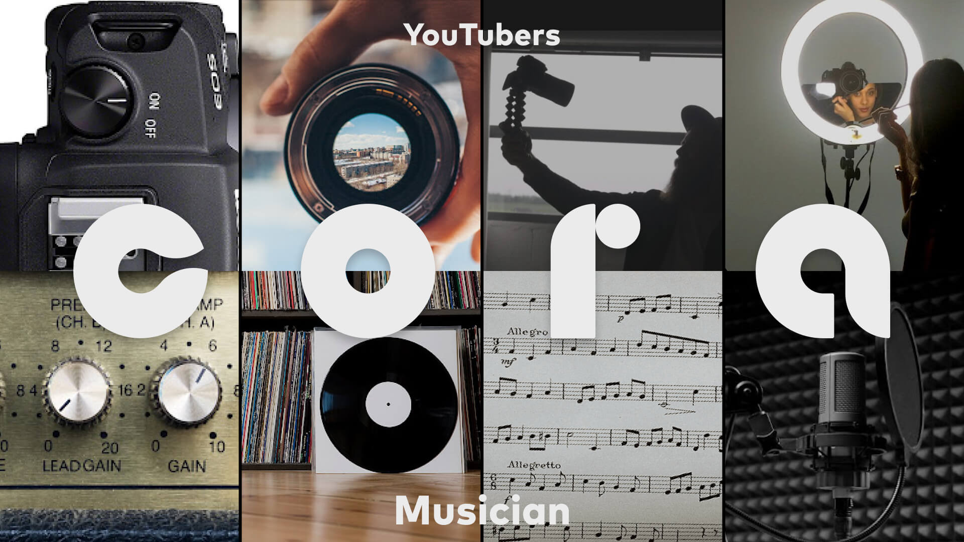
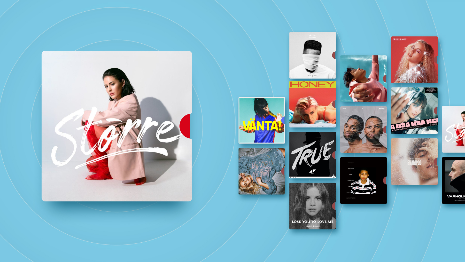
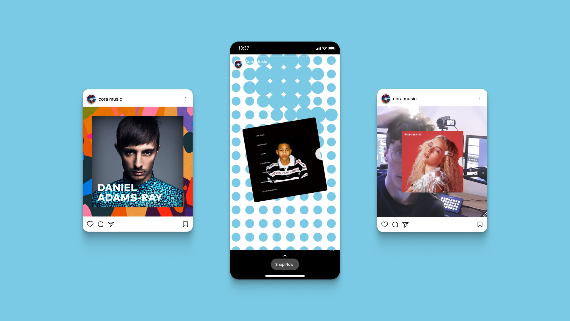
The Cora visual identity is a bold and dynamic design that is made to capture the attention of YouTube influencers and musicians. The use of circles and curves in the design, along with the bold color scheme and clean typography, creates a visually engaging and memorable brand image. This project is a testament to the power of design in creating a strong brand identity that resonates with its target audience.
Scope_
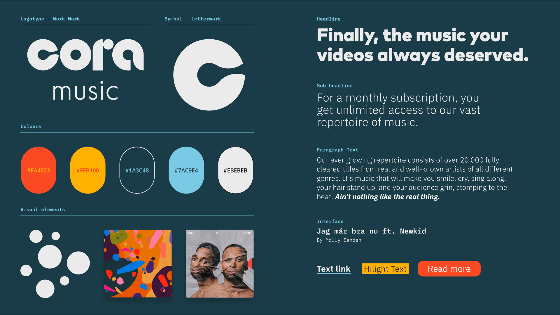
— Logo, Typography & Color
— Messaging
— Website Concept Design
— Illustration
— Social Templates
— Brand Guidelines

The Shapes
The circular letters in the logo are flirting with both musicians and YouTuber's world and everyday life. From both the modern world of cameras and ring lights to the analog touch with vinyl records and amplifiers. Looking closer at this you find out that they are pretty damn similar.
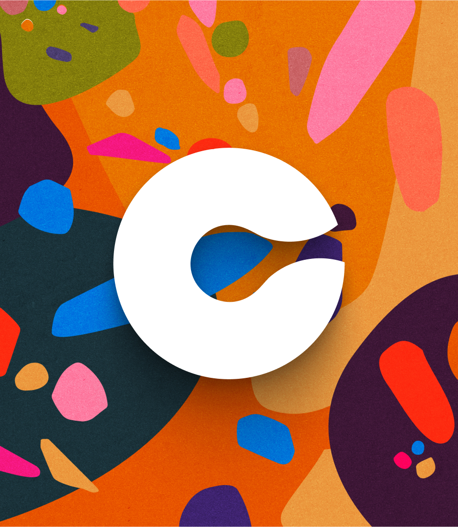
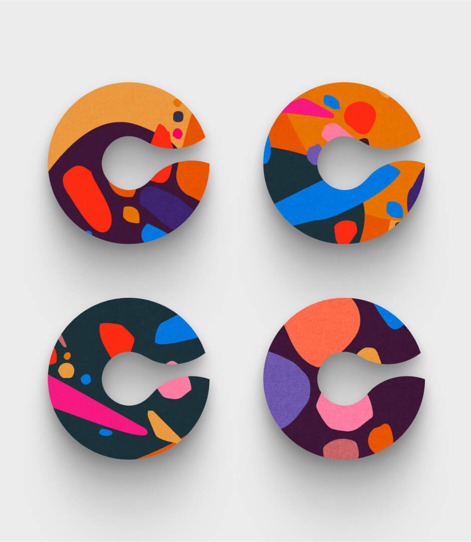
Colors n pattern
The color pallet is strong and vibrant for brave and bold executions. But the lead color splash is the weird psychedelic pattern that acts as a strong hook and the core building blocks in the identity.

See allso
SVT — Melodifestivalen AppProject type
Cora Musik — Visual identityVisual identity
Halebop — RebrandingAnimation / Art Direction / Branding / Design / Film / Photography